AS-IS Journey
Based on user tests and core heuristics principles.
Click the image to full-screen navigate through the journey


Challenge failed:Displaying these journeys on this website, in a horizontal full-screen sticky scroll for the best experience.
It was evident where the problem was lacking- to strengthen the booking flow, which needed to be approached through a few priority tasks and a brand revamp.
TO-BE Ideal flow
On the basis of analysing competitors, data from user tests and implementing best UX practices. This was done to establish a kind of roadmap for the stakeholders to recognise and refocus on problem areas, instead of visual website revamps which wasn't a need for time.
Familiar methods motivated by competitors to assure the stakeholders of our decisions.
Click the image to full-screen navigate through the journey


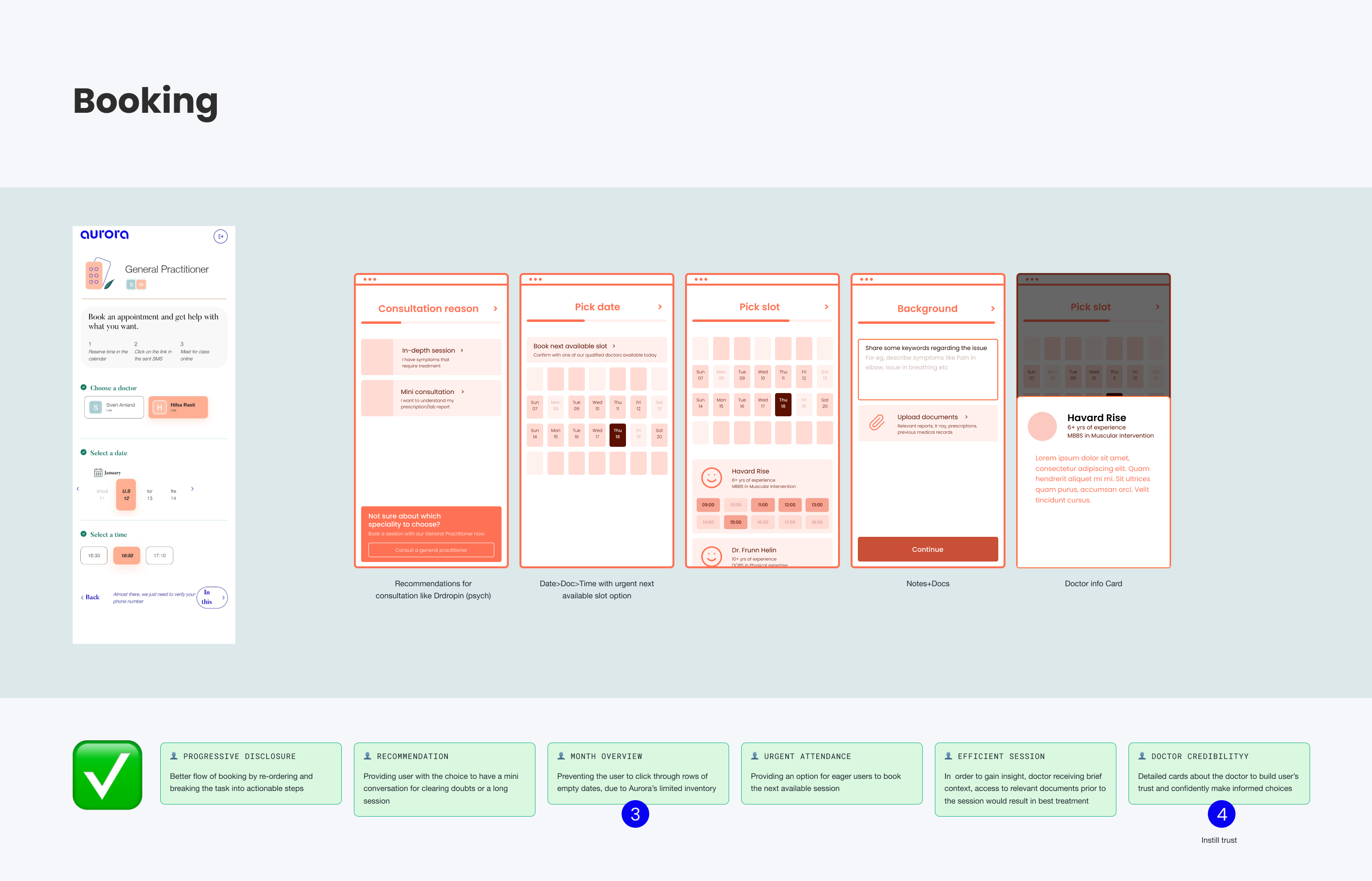
#1 Booking flow

Before the intervention
Challenge:
How might we manage User expectations?
↳ Having the limited inventory of an early-stage startup, often cases of less availability of specialists- leads to drop-offs. How can Aurora modify this?
Goal: From the to-be map we recognised 2 main problems,
1. Clear visibility of the Week Overview without disappointing users
2. Establishing trust and credibility towards the doctors!

Managing expectations early on, to display doctors accordingly.
#2 Verification
Redundant identification and rechecks on users lead to a bad experience. While matching it with tertiary competitors, a better way was learnt to tackle this flow.


Clear feedback with the flexibility of use and recap of booking details
Reflections
Allocation awareness
↳ Big plans for design changes but if a startup is in its early stages- the focus is on spending the funds wisely. So justifying how a certain small change, would have a big impact in raising future rounds.
Trust building
↳Brand revamping doesn't just refer to visuals for the sake of colours or styles. But the impact reflects the familiarity or perspective the user has towards the product
